


12 Oct Which color manifests your brand identity?
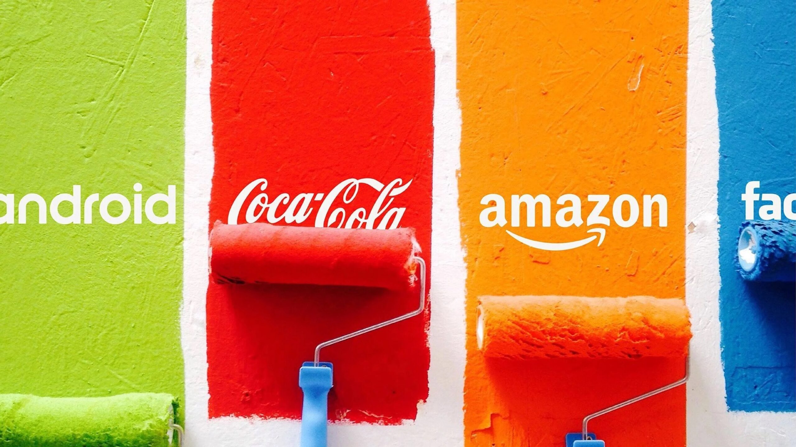
When you think of Nickelodeon, orange comes to mind; when you think of Coca-Cola, you imagine red; when you think of Facebook, you think dark blue. In the eyes of the target market, color repetition is part of the brand; it communicates the company’s values and visually differentiates it from competitors.
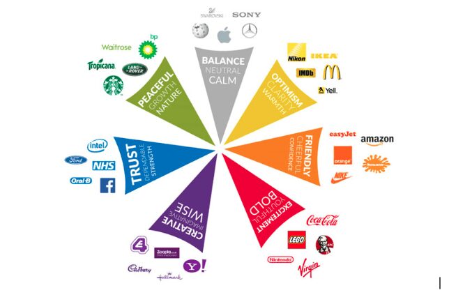
Different colors carry different meanings and trigger different emotions, such as the ones in the chart below. Before deciding your own brand’s colors, spend some time reviewing your competitors’ brand identities to ensure that yours stands out, and that the colors reflect your business’ personality and tone of voice.
A brand’s palate should include three colors:
- a base
- an accent,
- and a neutral color.
Your base color is the foundation of your color palate; it should reflect your brand’s most dominant personality trait. Your accent will be used almost as often as your base color. It should not only match the base color, but also be in line with your brand’s characteristics. Lastly, a neutral color that can be used as a background. Most often this color is not overpowering or attention-grabbing.
Keeping the above in mind, there are several options when it comes to creating a color scheme:
- Monochromatic: A monochromatic color scheme consists of different shades of the same color. For brands with one trait that dominates over all the others, monochromatic schemes offer a great solution.
- Analogous: Analogous colors are next to each other on the color wheel (e.g. red and orange), and usually have similar emotional connotations, but not as strongly as a monochromatic palate. Analogous color schemes are safe, but do not stand out as much.
- Complementary: Colors that are directly opposite each other on the color wheel are known as complementary colors. These colors, when paired, bring out the best in each other (e.g. yellow and purple). The stimulating and dynamic nature of complementary color palettes makes them very popular, so be mindful that your color scheme does not match another brand too closely.
- Triadic: Triadic colors are evenly spaced out on the color wheel (e.g. orange, purple, and green). These pallets are safe, stable, and offer variety, but need to accurately reflect your brand identity.
Research demonstrates that consumers perceive the same characteristics in brands as they do in people; consumers rely on emotional associates and instinct to choose your brand over others. An effective, consistent visual identity will foster loyalty, beyond just a one-time decision. These colors should be present across all consumer touch-points: your website, your logo, social media, product packaging, etc.
Putting together a visual brand can be intimidating. We’d love to help.
Sorry, the comment form is closed at this time.