Every agency has a first project. Most people won’t admit what they’re actually looking like. Ours was Allymac, and thirty years later, the work still holds up in ways that have nothing to do with luck. The Allymac brand strategy came together before we had a formalized process, which means it ran entirely on instinct and fundamentals. As it turned out, that’s exactly what the project needed.
What Made Allymac Harder Than It Looked
The Category Sets the Rules Before You Do
Financial services is not a forgiving space for experimentation. Clients walking into a financial conversation need to feel something before a single word gets spoken, and what they need to feel is that they’re in capable hands. The visual language of the brand has to carry that weight on its own, before anyone picks up the phone or books a meeting.
That constraint wasn’t a creative limitation. It was the clearest possible brief. The brand needed to signal credibility in a category where credibility is the product. Once that was established, every decision had a filter.
First Projects Don’t Come With a Net
There was no portfolio to reference, no client precedent to point to, and no established process to follow. Every call the work demanded had to get made on instinct and judgment alone. That kind of environment, if you let it, forces you back to fundamentals rather than reaching for novelty to compensate for uncertainty.
The instincts that guided Allymac are the same ones that guide the work today. Know the industry cold. Find what actually sets the brand apart from every other option in the category. Design for trust rather than attention, and build for ten years out instead of the pitch deck.
The Decisions That Made the Brand Work
Color Does More Than Set a Mood
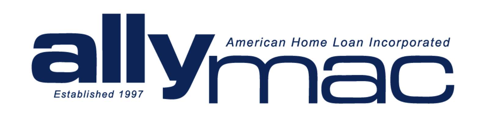
The deep navy palette Allymac landed on wasn’t chosen for aesthetics. Navy in financial services communicates stability and reliability, which are the two things a financial brand has to earn before a prospect will take a meeting. The color was doing strategic work before anyone read a word of copy.
This is a distinction most brands miss entirely. Color functions as a positioning decision, not a creative preference. The wrong palette in financial services doesn’t just look off — it signals the wrong thing to the right audience, and that costs you opportunities you’ll never know you lost.
Typography That Holds Two Things at Once
The Allymac wordmark used lowercase letterforms at a weight and spacing that read as grounded rather than casual, which gave the mark something rare: approachability and authority occupying the same space. Landing that balance is harder than it sounds. Brands that try to serve two registers usually dilute both. Allymac found the point where they could coexist without contradiction, and it held.
Restraint Is the Decision Most Brands Skip
The layout organized three elements, the wordmark, the descriptor, and the establishment date, without stacking them in a way that felt rigid or templated. The result was a mark that felt considered from every angle.
What the logo didn’t have matters as much as what it did. No gradients, no effects, no visual noise competing with the identity. Every absent element represented a decision someone had to make and hold against the pressure to keep adding. That pressure is constant on any branding project, because adding something feels like justifying the work. The brands that age well are almost always the ones where someone said no more than yes.
What Allymac Still Gets Right
Longevity Comes From Clarity, Not Originality
Allymac is no longer in business. The brand had nothing to do with that. The owner made a separate business decision, and the identity outlasted the context it was built for. That distinction matters because it tells you something real about what brand strategy actually does.
A brand built for longevity doesn’t depend on a trend cycle to stay relevant. Allymac worked because it was immediately understood, visually appropriate for its category, and distinct enough to be remembered without being novel enough to date itself. Those are the four markers worth building toward on any branding project, in any industry, at any budget:
- Immediate clarity over creative cleverness
- Visual fit with the category the brand operates in
- Enough distinction to register without dependence on trend
- Scalability across formats without losing coherence
The Process Formalized What Instinct Already Knew
The difference between how we approached Allymac and how we approach a brand project today isn’t the principles. It’s the repeatability. The instincts that shaped Allymac now live inside a structured process, which means the outcome doesn’t depend on a good day or a lucky read of the brief.
Every brand project starts in the same place, regardless of category or budget size. What does this brand need to be known for? What does the audience need to feel before they say a word? Where can the identity introduce distinction without breaking the trust the category requires?
From those answers, positioning comes first. Messaging follows. Visual identity earns its decisions by tracing back to the strategic brief rather than running on the designer’s instincts alone. That sequence is what keeps the work from being creative for its own sake.
Thirty Years Later, the Fundamentals Haven’t Moved
Allymac wasn’t a perfect project. It was a first project. What made it work was that the important decisions were made correctly, and those decisions were made in the right order. Strategy before aesthetics. Trust before attention. Longevity before applause.
That’s still the standard. If your brand can’t survive as a single solid color on a pen or a business card without losing its identity, the foundation isn’t ready. If your identity was built around what was trending when you launched, you’ve already started the countdown.
A brand that holds up isn’t built by accident. Book a strategy session with Silesky Marketing and find out what yours is actually built on.