How our first political campaign proved branding can win attention before a single word is spoken.
When we took on our first political campaign at Silesky Marketing, we knew one thing immediately: if we played by the usual rules, we’d disappear.
Politics is a sea of sameness.
Red. White. Blue.
Stars. Stripes. Serif fonts that all blur together.
And somewhere in that noise, every candidate is trying to convince voters they’re different.
That contradiction is exactly where we saw the opportunity.
The Problem: Everyone Looks the Same
Walk past a row of campaign signs, and you’ll notice something: they’re practically interchangeable. The colors signal “patriotism,” but they don’t signal identity.
That’s a branding failure.
Because in a crowded field, recognition is everything. If voters can’t instantly pick you out—visually—you’re already losing attention before your message even lands.
The Strategy: Be Bold Enough to Be Remembered
Instead of leaning into tradition, we made a deliberate choice:
Ditch the expected. Own something distinctive.
For Amy Blank’s campaign, we built a visual identity around purple and orange—a combination you rarely see in political branding.
Why it worked:
- Purple subtly bridges red and blue; unity without cliché
- Orange injects energy, urgency, and action
- Together, they pop in a landscape of sameness
This wasn’t just about looking different. It was about feeling different.
The Execution: Cohesion Over Chaos
We didn’t stop at a logo. We built a full, consistent brand system:
- Campaign signage that couldn’t be ignored
- Branded apparel that supporters were excited to wear
- Print collateral that looked more like a modern brand than a traditional campaign
- Messaging anchored in a clear, repeatable idea:
“Less Politics. More Action.”
“Less Politics. More Action.” doesn’t just read like a tagline, it lands like a release valve! It captures a frustration people already carry and flips it into something hopeful and forward-moving. Candidates tend to over-explain, overpromise, and overcomplicate. This line does the opposite: it strips everything down to what actually matters—results. It quietly challenges the status quo without sounding combative, and that’s the magic. You don’t have to agree with every policy to feel the pull of it—you just have to be tired of the noise. And when a message is that instantly understood, that emotionally resonant, and that easy to repeat, it stops being copy… and starts becoming a rallying cry.
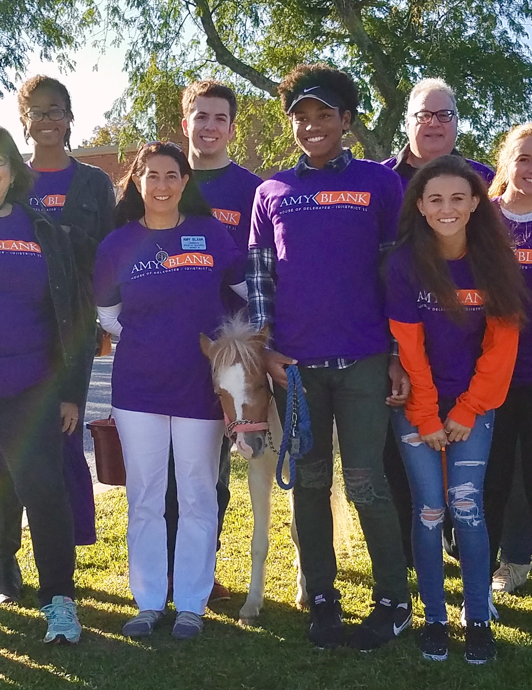
![]()
The Moment It Clicked
When you see a group of supporters wearing the same bold, nontraditional color palette—standing together, smiling, energized, you realize something:
This doesn’t feel like a typical campaign.
It feels like a movement.
And that’s the shift great branding creates. It turns passive recognition into an emotional connection.
What This Taught Us (And Why It Matters)
This campaign reinforced a principle we now apply across industries:
1. Safe is invisible
If you look like everyone else, you’ll be treated like everyone else.
2. Branding is strategy, not decoration
Colors, typography, and design choices aren’t aesthetic decisions—they’re positioning decisions.
3. Differentiation buys attention
And attention is the gateway to influence.
4. Consistency builds credibility
Every touchpoint should reinforce the same identity. No exceptions.
The Bigger Takeaway
Political campaigns are just one of the most obvious examples of a crowded market—but the lesson applies everywhere.
If your brand blends in, it’s not competing. It’s coasting.
And coasting doesn’t win.
Our First Campaign—But Not Our Last
This project wasn’t just a milestone because it was our first political campaign.
It was a turning point in how we approach branding:
We don’t aim to fit in.
We design to stand out and stay remembered.
If you’re building something in a crowded space, here’s the question worth asking:
Are you recognizable from across the street… or just another sign in the yard?
That answer changes everything.