
The Brand That Started It All: A Look Back at Allymac

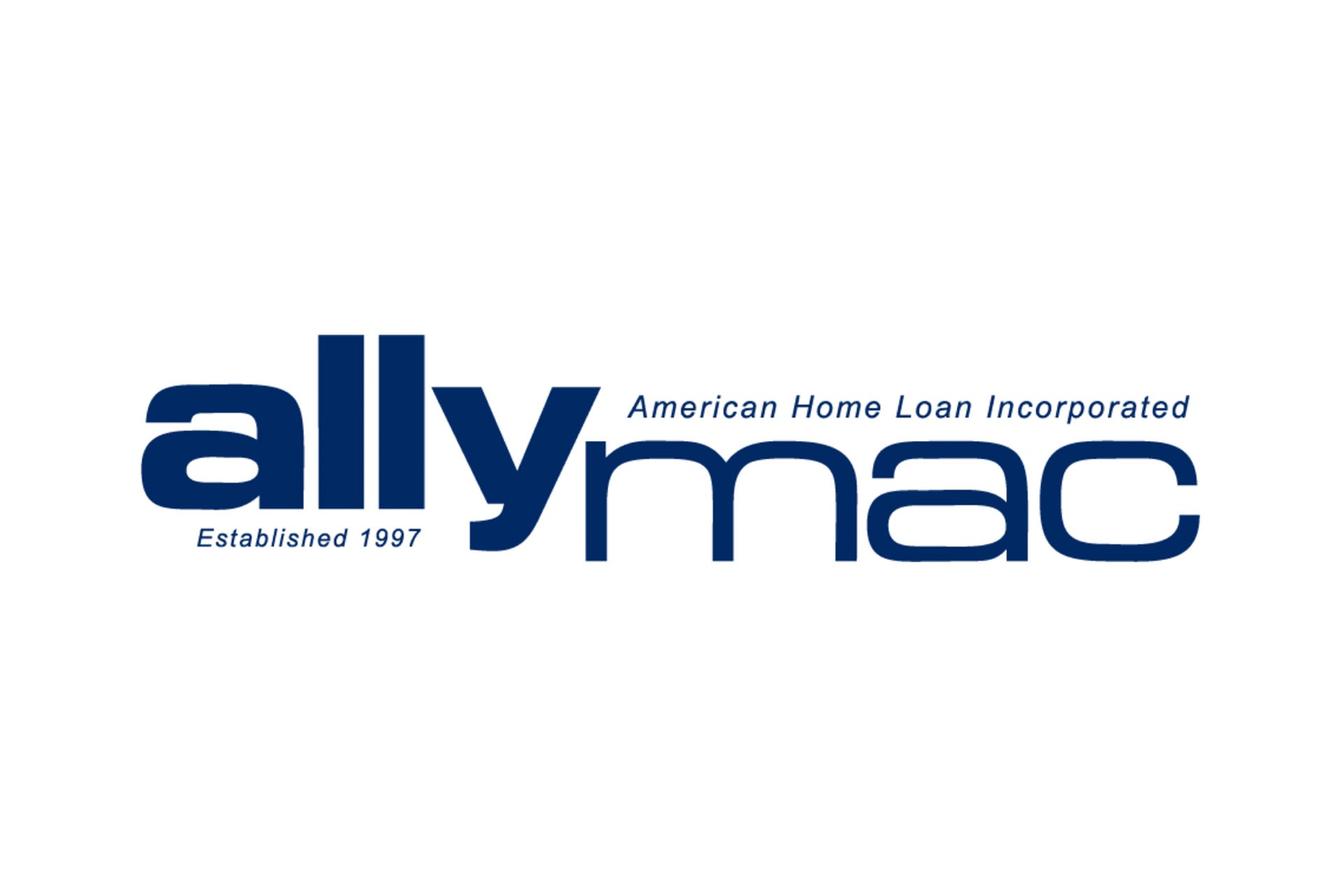
Every agency has a first project. Most people won’t admit what they’re actually looking like. Ours was Allymac, and thirty years later, the work still holds up in ways that have nothing to do with luck. The Allymac brand strategy came together before we had a formalized process, which means it ran entirely on instinct and fundamentals. As it turned out, that’s exactly what the project needed. What Made Allymac Harder Than It Looked The Category Sets the Rules Before You Do Financial services is not a forgiving space for experimentation. Clients walking into a financial conversation need to feel something before a single word gets spoken, and what they need to feel is that they’re in capable hands. The visual language of the brand has to carry that weight on its own, before anyone picks up the phone or books a meeting. That constraint wasn’t a creative limitation. It was the clearest possible brief. The brand needed to signal credibility in a category where credibility is the product. Once that was established, every decision had a filter. First Projects Don’t Come With a Net There was no portfolio to reference, no client precedent to point to, and no established process to follow. Every call the work demanded had to get made on instinct and judgment alone. That kind of environment, if you let it, forces you back to fundamentals rather than reaching for novelty to compensate for uncertainty. The instincts that guided Allymac are the same ones that guide the work today. Know the industry cold. Find what actually sets the brand apart from every other option in the category. Design for trust rather than attention, and build for ten years out instead of the pitch deck. The Decisions That Made the Brand Work Color Does More Than Set a Mood The deep navy palette Allymac landed on wasn’t chosen for aesthetics. Navy in financial services communicates stability and reliability, which are the two things a financial brand has to earn before a prospect will take a meeting. The color was doing strategic work before anyone read a word of copy. This is a distinction most brands miss entirely. Color functions as a positioning decision, not a creative preference. The wrong palette in financial services doesn’t just look off — it signals the wrong thing to the right audience, and that costs you opportunities you’ll never know you lost. Typography That Holds Two Things at Once The Allymac wordmark used lowercase letterforms at a weight and spacing that read as grounded rather than casual, which gave the mark something rare: approachability and authority occupying the same space. Landing that balance is harder than it sounds. Brands that try to serve two registers usually dilute both. Allymac found the point where they could coexist without contradiction, and it held. Restraint Is the Decision Most Brands Skip The layout organized three elements, the wordmark, the descriptor, and the establishment date, without stacking them in a way that felt rigid or templated. The result was a mark that felt considered from every angle. What the logo didn’t have matters as much as what it did. No gradients, no effects, no visual noise competing with the identity. Every absent element represented a decision someone had to make and hold against the pressure to keep adding. That pressure is constant on any branding project, because adding something feels like justifying the work. The brands that age well are almost always the ones where someone said no more than yes. What Allymac Still Gets Right Longevity Comes From Clarity, Not Originality Allymac is no longer in business. The brand had nothing to do with that. The owner made a separate business decision, and the identity outlasted the context it was built for. That distinction matters because it tells you something real about what brand strategy actually does. A brand built for longevity doesn’t depend on a trend cycle to stay relevant. Allymac worked because it was immediately understood, visually appropriate for its category, and distinct enough to be remembered without being novel enough to date itself. Those are the four markers worth building toward on any branding project, in any industry, at any budget: Immediate clarity over creative cleverness Visual fit with the category the brand operates in Enough distinction to register without dependence on trend Scalability across formats without losing coherence The Process Formalized What Instinct Already Knew The difference between how we approached Allymac and how we approach a brand project today isn’t the principles. It’s the repeatability. The instincts that shaped Allymac now live inside a structured process, which means the outcome doesn’t depend on a good day or a lucky read of the brief. Every brand project starts in the same place, regardless of category or budget size. What does this brand need to be known for? What does the audience need to feel before they say a word? Where can the identity introduce distinction without breaking the trust the category requires? From those answers, positioning comes first. Messaging follows. Visual identity earns its decisions by tracing back to the strategic brief rather than running on the designer’s instincts alone. That sequence is what keeps the work from being creative for its own sake. Thirty Years Later, the Fundamentals Haven’t Moved Allymac wasn’t a perfect project. It was a first project. What made it work was that the important decisions were made correctly, and those decisions were made in the right order. Strategy before aesthetics. Trust before attention. Longevity before applause. That’s still the standard. If your brand can’t survive as a single solid color on a pen or a business card without losing its identity, the foundation isn’t ready. If your identity was built around what was trending when you launched, you’ve already started the countdown. A brand that holds up isn’t built by accident. Book a strategy session with Silesky Marketing and find out what yours is actually built on.

Marketing Lessons from 30 Years of Building Brands

The marketing lessons from 30 years at Silesky come from the distance between how this agency started and how it operates today. That distance holds more than the early wins, the awards, the referrals, or the campaigns sharp enough that competitors copied them without permission. Part 3 of this series traced the closure in 2006, the decade of rebuilding, and the relaunch in 2016. This piece covers what three decades of building, losing, and building again leave behind. “I started my business completely winging the whole thing,” Susi says. “Exactly what I tell my clients not to do.” The Standard That Kept Brands Alive for Decades Most agencies measure experience in years listed on a website. Silesky measures it in what held and what didn’t. Susi and her first hire, Kim Morehead, produced logos and brand systems in the late 1990s that are still in use today. Those marks lasted because the work was built to outlast the decade it was made in. One Question Before Any Logo Ships The standard Susi applies to every logo starts with one question. Does the mark work in one solid color, and does it read clearly at pen size? If the answer is no, the logo isn’t finished. Gradients, layered effects, and typography readable only at a specific scale all fail. Brand systems built without this standard tend to need revisiting within five to seven years. Those built with it age without a rebuild. Clients rarely notice the difference during the project. A decade later, when the file still works exactly as intended, the principle proves itself. Why Clients Push for More and Why That Direction Fails Every first creative review produces the same client instinct to add more information to the card, a second color to the logo, or another line to the headline. Susi’s job, across 30 years, has been to move the other way. The brands with the longest shelf life contain less than the client originally requested. Restraint made them durable. Across hundreds of projects and multiple decades, three principles have not shifted: Simplicity wins. Less is always more. Longevity matters more than trends. The discipline to stop before the work gets crowded is harder to practice than adding one more element. Experience teaches you when to stop, and that discipline separates brand work with a ten-year shelf life from work that feels dated in three. The same pattern plays out when Silesky steps into a new client relationship. What an Outside Set of Eyes Sees on Day One After three decades of coming into businesses from the outside, Susi describes a consistent pattern. Founders lose the ability to read their own operation the way a stranger reads it. Day-to-day demands replace the outside perspective entirely, and the gaps forming go unnoticed because everyone inside has stopped looking for them. A fresh reader sees what familiarity hides. The Gap Between the Pitch and the Page The most common gap Silesky finds on day one sits between how the founder describes the business in conversation and what the website says. In person, the founder is specific, clear, and confident about what sets them apart. The landing page says something generic and indistinguishable from every competitor in the category. Nobody inside the organization catches this because nobody inside reads the website as a stranger would. Closing this gap is frequently the most valuable work of the first 60 days. The written language has to carry the same specificity and energy as the in-person pitch. When the Brand Has Outgrown the Business Behind It A second pattern shows up in businesses whose marketing has stayed the same while the business moved forward. Expertise grows, clients shift to a different tier, and the work produced looks nothing like it did three years ago. The website, the logo, and the messaging still describe an earlier version of the business, and nobody inside has flagged the distance. Left unaddressed, the misalignment costs real money. Prospects form an impression before they ever make contact, and when the website’s version of the business doesn’t match the conversation, trust erodes early. Two signals Silesky watches for in new engagements: Messaging on the homepage reads like a first-year pitch, not a seasoned operation. Outdated positioning describes work the team stopped doing years ago. What Starting Without a Strategy Teaches You The founding story of Silesky is also its most instructive cautionary tale. The business launched without a plan, without clients, and without revenue, running on instinct, relationships, and a willingness to solve problems in motion. For a time, that approach worked. Then the limits of building without a foundation became clear, and the cost of that clarity was significant. Silesky’s Own Origin as the Cautionary Tale In 2006, the agency closed with five employees. The freelance years that followed brought clarity more than comfort. Susi spent that period examining what had held and what had given way, then arrived at conclusions the hard way. The agency that relaunched in 2016 was a different one, built on a foundation the original never had. Susi now leads every client engagement with strategy before execution. The Silesky process follows a clear sequence: Audit the current marketing first. Identify where the gaps are costing money. Build the plan. Hand the plan off or execute it directly, then maintain and adjust it over time. How to Identify a Client Who Skipped the Strategy Step Clients who arrive without a strategy are easy to identify after 30 years of watching the pattern. They have materials on hand, money going out, and a social feed that’s running. What none of it has is a legible connection between the money going out and the business being built. The campaigns exist in isolation. The branding doesn’t match the pitch, and the social feed has no relationship to the sales conversation. The fix is a plan built before the next dollar moves. Thirty Years Later, the Work Speaks for Itself The work Susi produced a quarter century ago

Branding VS. Logo Design

Branding vs. logo design is important for creating a visual identity for a business or organization. However, they serve different purposes. A logo is a visual symbol or icon representing a brand and typically consists of a graphic and/or typographic design. It serves as a recognizable and memorable mark that helps to identify a company, product, or service. On the other hand, a logo is designed so that consumers will recognize the brand immediately upon seeing the logo. On the other hand, branding encompasses a broader range of elements that collectively shape the perception of a brand in the minds of its audience. This includes the brand’s values, messaging, voice, personality, and visual identity (including the logo). Read on for more information about branding vs. logo design and how they differ. Why is Branding So Important? Branding is the process of defining and communicating what a company or organization stands for and how it wants to be perceived by its audience. So, while a logo is a critical component of a brand’s visual identity, branding encompasses much more than just the logo design. Logo design is a subset of branding explicitly focused on creating a graphic mark representing the brand. The logo should be memorable to consumers, and designing a good logo results in effective branding. Building Effective Branding When building a brand, it is essential to note that it is much more than just logo design and colors. The brand is the company’s emotion and what the business stands for. It is what you want consumers to feel when they see the logo. This is crucial to the company because you want to express the business’s ideals and goals through your branding and convey the message to consumers. Branding should exhibit consistency and follow a good strategy. A logo is for identification, but a brand expresses how you want the audience to see the company. Creating an eye-catching, memorable logo is very important. However, a company needs to have branding that exceeds expectations. Branding is where success for any business starts. Good branding will make it much easier for the company to grow and thrive. At Silesky Marketing, we ensure that your logo and branding are exceptional. For your branding needs, contact Silesky Marketing at 410-205-6168.

Aizaz Ul Hassan

Sr. Graphic Designer & Web Developer

Aizaz has been the driving force behind Silesky’s web development for over 5 years. As both a graphic designer and UI/UX developer, he brings a rare mix of technical precision and creative clarity to every project. What sets Aizaz apart is his ability to understand and interpret the assignment—no extra hand-holding, just sharp instincts and calm professionalism. When timelines are tight and expectations are high, Aizaz is the teammate you want in your corner.

Creative and detail-oriented, Aizaz builds clean, modern websites that marry style with substance. From intuitive flows to scalable layouts, his work consistently delivers digital experiences that perform as well as they look. With every project, Aizaz ensures the design feels effortless for users and does the heavy lifting for the brand.

Off the clock: It's an ongoing mystery.

John Sindorf

Director of Strategic Alliances

John believes most businesses don’t need more vendors, they need the right strategic partners.

With decades of experience helping small and mid-sized organizations grow, John specializes in connecting business leaders with the expertise they need to overcome challenges, strengthen operations, and scale with confidence. Whether the conversation centers on sales strategy, marketing, AI, or operational efficiency, his focus is always the same: identifying the right solution for the business, not simply adding another service provider.

Known for his relationship-first approach, John builds partnerships rooted in trust, practical guidance, and measurable outcomes. He helps business owners simplify complex decisions, align the right resources, and spend less time managing vendors and more time leading the businesses they’ve worked so hard to build

Off the clock: You’ll likely find John networking over coffee, strengthening relationships, and proving that the best business opportunities still begin with genuine conversations.

Kiki DeVane

Marketing Operations Manager

From Capitol Hill to the Content Calendar. The Filibuster Didn't Make the Cut.

Kiki started her career trying to change the world through legislation. She pivoted to marketing after realizing a well-built website could do it faster. What followed was a stretch across event marketing, federal communications, and sponsored content for some of the world's most recognizable brands, enough range to make her what the industry calls a utility player, which mostly means she can do the thing no one else wants to do and make it look intentional.

At Silesky Marketing, her job is to make sure the right work gets to the right person at the right time. When something tries to fall through the cracks, she's already caught it.

Off the clock: Somewhere between a passport stamp and a paintbrush.

Meital Abraham

Market Expansion & Social Media Strategist

Compulsive Jazz Hands

Meital studied fine art, advertising, and philosophy before adding stand-up comedy to the mix, which is either a very strange combination or the exact right training for social media strategy. Comedy teaches you to read a room, adapt to shifting audience energy, and deliver a punchline precisely when it matters. Misread a crowd on stage, and you get silence. Misread it in an algorithm, and it shows in the metrics. Her first corporate accounts were a cemetery, a law firm, and an IT company. She figured them all out.

Off the clock: Currently finding new ways to bedazzle herself and dazzle the audience.

Mya Stengel

Content Developer

Organizing Her Bookshelf = Organizing Her Life

Mya spent years working on her written prose only to pivot into writing for film in Hollywood. She went as far as to work in the film development department at Blumhouse before transitioning to content marketing. What she brought from the development room is the Hollywood standard. Never negotiate. Every draft has a skeleton before it gets a voice. To Mya, every client is a new protagonist to study. Her job is to entirely disappear into a brand's architecture, making the final copy sound authentically like them.

Off the clock: She's in the movie theatre, patiently waiting for Nicole Kidman to remind her that heartbreak feels good in a place like this.

Ashelin Walker

Digital Growth Strategist

The Human Embodiment of a Zen Garden

Before Ashelin was in Google Analytics, she was managing a fast-paced cafe. When the POS system crashed 20 minutes before doors opened, she rebooted it, rerouted the payment terminal, and had the register running before the first customer arrived. That same instinct drives every digital campaign she manages at Silesky Marketing today. She tracks algorithmic shifts, adjusts budgets in real time, and ensures clients see the concrete numbers behind every strategic decision.

Off the clock: She’s likely baking… What? it is a mystery she refuses to solve for us.

Susi Silesky

Founder & Brand Architect

Thinks in two languages. Solves problems in one.

Susi has spent more than 30 years helping clients see what's possible, and clearing the path to get there. She founded Silesky Marketing in 1996 after her early career in Paris, where she worked as the American liaison at S3C Groupe de Communication Souham, working on large-scale marketing campaigns for Sara Lee, Gillette, and Tiffany and Co.

Helping American brands navigate language and cultural differences taught her something that's shaped every engagement since: businesses often struggle to see themselves the way customers do. When she's not in client strategy, she's watching French films, which after thirty years of brand voice reviews pulls her out of English completely.

Off the clock: Scouting for strangers…or as she calls them, her new best friends.