Why Website Redesigns Fall Flat and What Actually Fixes the Problem

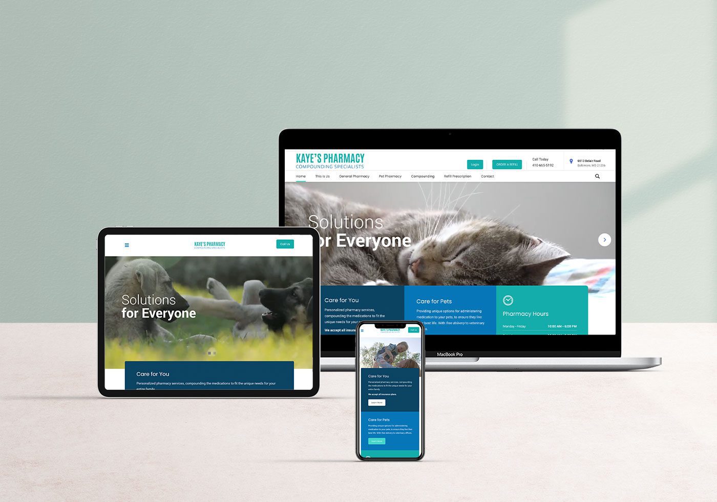
There’s a familiar sting for marketing teams. A new website launches—carefully designed, full of the latest features—yet delivers lackluster results. Modern aesthetics and interactive tools are not enough. Many organizations find the real reason website redesigns fall flat in 2025 goes deeper than looks or technology. What appears to be a design problem often hides strategic gaps and missed opportunities to connect with real users. Chasing Trends Instead of Purpose Every year, new design trends and digital flourishes appear online. Teams feel pressure to adopt these styles—animated transitions, video backgrounds, bold color overlays. The hope is to seem modern and relevant. These design choices can elevate visual appeal, but they may distract from a site’s core goals. For example, a professional services firm might use playful colors to look innovative. This shift can alienate long-time clients who value familiarity and stability. A modern-looking interface doesn’t automatically create a better experience for the audience a business actually serves. Instead of focusing only on visual upgrades, organizations benefit by asking how each design element supports the brand’s promise and the needs of users. Strong online presences are built by aligning aesthetics with clear purpose. Losing Touch with the Real Audience In 2025, data about user behavior is more abundant than ever. Still, meaningful insight often gets lost in translation when teams focus on assumptions about their audience rather than observed behaviors. Redesigns that chase the preferences of hypothetical “ideal” users risk neglecting the routines of current, loyal customers. Imagine a consulting company that revamps its entire site for mobile efficiency, while most clients prefer accessing detailed resources on desktop. Overemphasis on innovation sometimes obscures the practical features that returning users value. Success comes from an ongoing commitment to understanding real users, gathering regular feedback, and responding to actual behaviors—not just statistical trends.Bullet points and heatmaps, paired with honest conversations, often reveal blind spots that site analytics alone can’t capture. Overlooking Fundamental Business Issues Website redesigns typically begin with calls for better aesthetics, faster loading times, or improved SEO rankings. Yet these are often symptoms of more significant, unresolved business challenges. Cosmetic updates alone do not solve deeper problems like unclear service offerings, convoluted product categories, or a lack of trust signals. For instance, a retailer may present a bold new look, but if checkout remains confusing or support is buried, shoppers will leave frustrated. Businesses sometimes invest in visual refreshes, hoping design will compensate for operational shortcomings. It rarely works. Lasting improvements start by identifying the underlying barriers to growth—be it messaging, navigation, or product clarity. Once addressed, design and technology have the foundation they need to make a difference. The Pitfall of “Launch and Leave” Redesign projects often demand months of focused energy, but once a new site goes live, attention tends to shift away quickly. Treating a website launch as a final destination rather than a new starting point can limit long-term success. The most successful organizations treat their websites as evolving platforms, using data and user feedback to drive continuous improvement. Routine content updates, regular usability tests, and small iterative changes keep digital experiences aligned with shifting user expectations. Letting a site stagnate, even if it launched beautifully, invites competitors to outpace you as technology and preferences evolve. Shifting from project-based thinking to a mindset of ongoing growth keeps digital properties relevant and high-performing. Stakeholder Conflicts and Decision Paralysis When every department pushes for visibility, the risk of losing focus rises. Multiple teams lobbying for homepage real estate often results in cluttered layouts and muddled messaging. Features and banners multiply as various voices press their priorities, diluting the clarity of the value proposition. In practice, this might look like a homepage overloaded with pop-ups, promotions, and competing calls to action, leaving visitors unsure where to focus. Without a strong decision-maker to filter input and maintain direction, the user experience suffers. Empowered leadership and a commitment to audience needs over internal politics keep redesign projects on course and user-friendly. Technology Chosen for the Wrong Reasons The landscape of web development in 2025 is saturated with new tools and frameworks—headless CMS platforms, AI-powered plugins, and complex integrations all vying for attention. While these technologies promise flexibility and innovation, they can create headaches if selected without a clear use case. Organizations sometimes add the latest features in hopes of boosting credibility, but end up with slower load times or complicated workflows. For example, an advanced personalization tool may sound attractive, but if it disrupts navigation or fails to deliver relevant content, it can frustrate users and erode trust. New technologies should support clear objectives—streamlining user journeys, improving access to information, or enabling better service—not simply checking boxes for innovation. Measuring Progress That Matters Metrics like page views and session duration are easily tracked, but they don’t always reveal whether a redesign achieved meaningful results. Organizations often celebrate spikes in traffic or lower bounce rates without tying those numbers to business outcomes such as lead quality, customer retention, or sales. Effective measurement strategies focus on actionable KPIs and user behaviors that support broader organizational goals. For example, tracking form completion rates, repeat visits, or average order values yields insights that directly connect web performance to business impact. By prioritizing substance over appearance in measurement, teams are better equipped to adapt their strategies and deliver real value. Building Websites That Stand the Test of Time Digital trends may come and go, but the most resilient websites are built with substance and adaptability. Teams that dedicate time to understanding their audiences, address core business issues, and treat their sites as evolving platforms consistently see stronger results. Thoughtful leadership, strategic use of technology, and focus on authentic metrics set high-performing websites apart. Instead of chasing fleeting trends, organizations should ask tough questions and stay connected with users. This approach leads to lasting digital success. In 2025, the real advantage isn’t having the flashiest site. Success comes from a user experience that is purposeful, consistent, and matched to real-world needs.

How a Fresh Website Design Boosts Lead Generation

A fresh website design boosts lead generation by creating an inviting, user-friendly experience that encourages visitors to engage and take action. In today’s digital landscape, first impressions matter, and your website often sets the tone for customer relationships. When your site is modern, optimized, and visually appealing, it acts as a magnet for leads, helping your business grow faster and smarter. Why Your Website is Key to Lead Generation Your website serves as your digital storefront, often shaping the first impression potential customers have of your brand. If visitors find it outdated or difficult to use, they’re likely to leave and explore competitors. Essential Features of a High-Converting Website: Responsive Design: Ensure your site looks and works well on all devices. Clear Calls-to-Action (CTAs): Encourage visitors to take specific steps like subscribing or contacting your team. Fast Load Speeds: Keep visitors engaged by reducing wait times. Seamless Navigation: Make it easy for users to find what they need. A website designed with these elements becomes a powerful tool for driving lead generation, ensuring visitors stay and engage rather than bounce. User Experience: The Foundation of Lead Generation User experience (UX) is the secret sauce behind high-performing websites. When visitors enjoy navigating your site, they’re more likely to explore further and engage. How UX Drives Engagement: Simplified Layouts: Organize content to guide visitors toward your CTAs. Faster Load Times: A one-second delay can reduce conversions by up to 7%. Mobile Accessibility: With over half of all web traffic coming from mobile devices, a responsive site is essential. Accessibility Features: Tools like alt text for images and keyboard navigation expand usability. By prioritizing UX in your redesign, you create an inviting digital environment that naturally converts visitors into leads. Mobile Optimization: A Non-Negotiable for Lead Generation More than 50% of internet users browse on mobile devices. If your website isn’t optimized for smaller screens, you risk alienating a huge audience. Benefits of a Mobile-Friendly Website: Higher Engagement: Mobile users expect intuitive design and quick navigation. Improved Load Speed: Optimized mobile pages load faster, reducing bounce rates. Better SEO Rankings: Search engines reward mobile-friendly sites with higher visibility. Example: Consider a local business with a mobile-optimized website. They experience a 30% increase in contact form submissions after redesigning for mobile compatibility. This demonstrates the significant impact of mobile-first design on lead generation. The Power of Visual Design in Building Trust Visitors form opinions about your website almost instantly. A polished, modern design helps establish trust and credibility, while a cluttered, outdated look can drive users away. Tips for Visual Design Success: Professional Images: High-resolution visuals convey quality and attention to detail. Consistent Branding: Use uniform colors, fonts, and imagery to reinforce your brand identity. Whitespace: Allow breathing room between elements to improve focus and readability. Interactive Features: Tools like sliders and animations add a dynamic element to the user experience. By making thoughtful visual updates, your website becomes a compelling representation of your brand, fostering trust that leads to conversions. The Art of Strategic Call-to-Actions (CTAs) A website without CTAs is like a roadmap with no destination. Effective CTAs guide users toward meaningful actions, turning passive visitors into active leads. How to Craft Perfect CTAs: Use Clear Language: Action words like “Subscribe,” “Download,” or “Get Started” motivate users. Strategic Placement: Position CTAs at key points like the header, middle of the page, or after engaging content. Test Multiple Variations: Experiment with wording, colors, and placement to find what resonates. Make Them Stand Out: Use bold designs or contrasting colors to grab attention. Example: A service-based business redesigned its website to include CTAs like “Request a Free Consultation” on every service page. This resulted in a 40% increase in inquiries. SEO and Lead Generation: A Perfect Partnership A fresh website design offers an excellent opportunity to enhance your SEO strategy. Better SEO means higher search engine rankings, which leads to increased traffic and more potential leads. SEO Improvements During a Redesign: Optimized Images: Compress images to maintain quality while improving load times. Meta Descriptions: Include concise, keyword-rich descriptions for better click-through rates. Structured Content: Use headings and subheadings to make content scannable for users and search engines. Internal Links: Guide users to related pages to keep them on your site longer. Real-Life Results: Companies that invest in SEO as part of their redesign often see a 30% increase in organic traffic within six months. Content Matters: How to Engage Visitors Your website’s content plays a critical role in keeping visitors interested and turning them into leads. Without valuable, targeted content, even the best design will fall flat. Content That Converts: Case Studies: Showcase real-world success stories to build credibility. Blog Posts: Provide educational and engaging content to establish authority. Landing Pages: Create focused pages tailored to specific campaigns or audiences. FAQs: Address common questions to make visitors feel understood. Fresh, relevant content aligned with your audience’s needs ensures your site remains both informative and engaging. Measuring the Impact of Your Website Redesign Once your redesign goes live, monitoring performance is essential to assess success and identify areas for improvement. Metrics to Track: Bounce Rate: Indicates how well your site retains visitors. Conversion Rate: Measures how many users take desired actions, like filling out a form. Session Duration: Longer visits suggest higher engagement. Traffic Sources: Pinpoint where your leads are coming from, such as search engines or social media. Using tools like Google Analytics helps you refine your strategies for even better results over time. Conclusion A fresh website design boosts lead generation by delivering a seamless user experience, improving mobile compatibility, and optimizing for SEO. With modern visuals, strategic CTAs, and engaging content, your site can become a powerful driver of business growth. Investing in a website redesign isn’t just about keeping up appearances—it’s about creating a better platform for your business to thrive. Take the first step today and unlock your website’s full potential as a lead-generation powerhouse.

Your DIY Website Looks like a Middle School Science Project

Creating a website yourself can be a thrilling endeavor. However, many pitfalls can make your DIY website look like a middle school science project, but professional design services can elevate its appeal. A website is often the first interaction potential clients have with your brand, making it crucial to create a positive and lasting impression. From inconsistent branding to poor user experience, DIY websites frequently fall short in several key areas. This article explores the common mistakes of DIY web design and offers practical solutions to transform your site into a polished, professional platform that effectively represents your business and engages your audience. The Pitfalls of DIY Website Design When it comes to DIY website design, enthusiasm is often high, but the results can be underwhelming. The issue lies not in the effort but in the execution. Many people underestimate the complexity involved in creating a website that not only looks good but also functions smoothly. Common pitfalls include: Clashing color schemes Confusing navigation Poorly formatted content These elements can make your site appear amateurish and deter potential clients. Therefore, addressing these issues is essential for a professional appearance. Lack of Professional Aesthetics One of the most noticeable aspects of a DIY website that falls short is its aesthetic appeal. A professional-looking website needs to have a cohesive design that aligns with your brand’s identity. DIY websites often miss the mark with: Inconsistent fonts Uncoordinated color palettes Mismatched visual elements Thus, it’s essential to have a well-thought-out design that conveys professionalism and reliability to visitors. Attention to detail in visual consistency can significantly elevate the overall look of your website. Inconsistent Branding Branding is crucial for any business, and your website is a key part of your brand’s identity. DIY websites frequently suffer from inconsistent branding, which can confuse visitors and weaken your brand’s impact. Elements such as logos, color schemes, and typography need to be uniform across all pages. This consistency helps in establishing trust and recognition among your audience. To achieve this, create a branding guide that outlines these elements and ensures they are applied consistently. Poor User Experience (UX) A significant factor that differentiates a professional website from an amateur one is the user experience. DIY websites often fail to provide a seamless UX due to a lack of expertise in layout design, navigation, and interactive elements. A poorly structured website can frustrate users, leading them to abandon your site. Therefore, prioritizing a user-friendly design is essential for keeping visitors engaged and encouraging them to explore your offerings. Simple, intuitive navigation and a clear layout can drastically improve the user experience. Ineffective Mobile Optimization With the growing use of smartphones, having a mobile-optimized website is no longer optional. Unfortunately, many DIY websites are not designed with mobile users in mind, resulting in a subpar experience on smaller screens. Mobile optimization involves more than just scaling down content; it requires thoughtful reorganization of elements to ensure they are easily accessible and navigable on mobile devices. Responsive design principles should guide this process, making sure that content remains readable and interactive on all screen sizes. SEO Shortcomings Search Engine Optimization (SEO) is a critical aspect of online visibility. DIY websites often lack the necessary SEO elements that help in ranking higher on search engine results. These include: Meta tags Alt text for images Keyword-rich content Without proper SEO, your website may struggle to attract organic traffic, making it harder for potential clients to find you. Hence, incorporating SEO best practices is vital for online success. Regularly updating your content and utilizing tools like Google Analytics can help maintain and improve your SEO efforts. Technical Glitches and Load Times Technical issues such as slow load times, broken links, and unresponsive pages can severely impact the user experience. DIY websites are prone to these problems due to the use of inappropriate tools or lack of technical knowledge. Ensuring that your website is technically sound is crucial for maintaining user interest and improving your site’s performance. Regular checks can help mitigate these issues. Additionally, investing in reliable hosting services and optimizing images can significantly reduce load times. Lack of Professional Content Content is king, but only if it is well-crafted and relevant. DIY websites often feature content that is either too sparse or overly verbose, failing to strike a balance. Professional content writing ensures that the information presented is: Engaging Informative Aligned with your brand’s voice High-quality content is vital for holding the reader’s attention and conveying your message effectively. Consider incorporating multimedia elements like videos and infographics to make your content more engaging and easier to digest. Missed Marketing Opportunities A professionally designed website is not just about aesthetics; it is also a powerful marketing tool. DIY websites frequently miss out on integrating marketing strategies such as: Lead capture forms Social media links Call-to-action buttons These elements are essential for converting visitors into customers and should be strategically placed to maximize their impact. Effective use of these tools can lead to higher engagement rates and more conversions. Don’t forget to integrate analytics tools to track the performance of these elements and make data-driven improvements. How to Elevate Your Website Design Transforming your DIY website into a professional platform involves a combination of design refinement, technical optimization, and strategic content creation. Here are some steps you can take: Invest in Professional Design Services: Hiring a professional web designer can make a world of difference. They bring expertise and experience that can help you achieve a polished look that aligns with your brand. Ensure Consistent Branding: Work on creating a consistent brand identity across your website. This includes using uniform colors, fonts, and logos to create a cohesive look. Optimize for User Experience: Focus on creating an intuitive navigation structure. Make sure that visitors can easily find the information they need without getting frustrated. Mobile Optimization: Ensure that your website is fully optimized for mobile devices. Test your site on various screen sizes to confirm that it is responsive and user-friendly. Implement

What Not to do When Creating a new Website

So you want to build a new website. We have a list we call “what not to do when creating a new website” that might help. Don’t ignore mobile responsiveness With a large portion of internet users accessing websites on mobile devices, it’s crucial to have a website that looks and functions well on various screen sizes. Neglecting mobile responsiveness can lead to a poor user experience and lower search engine rankings. Don’t overload with content Avoid overwhelming visitors with too much content, especially on the homepage. Cluttered pages make it difficult for users to find what they’re looking for and can increase the website’s load time. Simplify navigation Keep your website’s navigation simple and intuitive. Complicated menus or confusing links can frustrate users and make it challenging for them to find what they need. Focus on page speed Slow-loading websites deter visitors and can negatively impact your search engine rankings. Optimize images, use caching, and choose a reliable hosting provider to improve your website’s speed. Pay close attention to SEO best practices If you want your website to be discovered by search engines, pay attention to search engine optimization (SEO). Neglecting SEO can hinder your website’s visibility and organic traffic. Accessibility is critical. Ensure your website is accessible to all users, including those with disabilities. Use alt tags for images, provide proper contrast for text, and follow accessibility guidelines. Using too many pop-ups Pop-ups can be intrusive and disrupt the user experience. If you must use them, do so sparingly and make it easy for users to close them. Neglecting security: Protect your website and its users by implementing proper security measures. Use HTTPS, keep your software up to date, and regularly back up your data. Not testing across different browsers: Your website may look and function differently on various browsers. Test your website on popular browsers to ensure consistent performance. Ignoring analytics: Install website analytics to track user behavior, popular content, and conversion rates. Analyzing this data will help you make informed decisions to improve your website. LESS is ALWAYS More. The Silesky Marketing mantra– less is ALWAYS more. Keep your design cohesive and professional by using a limited number of fonts and a consistent color scheme. Easy Contact System Make it easy for visitors to get in touch with you. Display clear contact information or a contact form prominently on your website. Test before you launch! Always thoroughly test your website before launching. Check for broken links, spelling errors, and any functionality issues. By avoiding these common mistakes, you’ll be on your way to creating a more effective and user-friendly website. Need more help? We’re here to help.

How to Make Your Website Stand Out and Convert More Visitors

If you are a business wanting to grow, the best place to start is your website. When people visit a website, they want to navigate quickly and know exactly where to go for what they are looking for. However, clients have a hard time deciphering your website. In that case, they will most likely click away and buy a product or service from competitors. We’ve compiled helpful information on how to make your website stand out against competitors so you don’t have to. Update Often Keeping a website relevant and updated is very important for business. You may decide to update and refresh your business’s branding after a few years. With updates, announce any changes and show your clients what updates are available such as new posts, news, or refreshed brand logo and colors. Clients will want to go and check out the new website and spend some time navigating through it. Create a Blog Blogs bring more traffic to your site and help share information about relevant topics and your business. People will want to learn more about specific topics and return to your site each time. Therefore, post blogs consistently, such as once a week. This will keep things fresh, and clients will know something new each week. Keep It Mobile Friendly Most internet scrolling happens on our phones. There’s nothing more frustrating than trying to navigate through a website that isn’t mobile-friendly. It is best to make sure your website will switch to mobile mode, and everything on it is easy to see and navigate. The goal is for the website to be easily visited on all devices so that it can be accessed at any time. If only a desktop version exists, traffic will differ from what you want. Use Video Current research shows that if a website page has a video, people will stay on the page much longer. Video captures attention and is useful for quickly showing what the website is all about. Video is preferred for delivering a product or service and reaching new and existing customers successfully. Knowing how to make a website stand out against competitors is important. Businesses do much better when they update their websites often and keep things consistent and relevant. If you want to refresh your website or branding, give Silesky Marketing a call.

Landing Pages vs Websites: What Each One Does and When to Use Both

When it comes to a landing page vs website, your website is the first impression you give to your clients or prospects, while your landing page is specifically made to describe an offer—like a free trial or coupon.   LANDING PAGE A landing page is a standalone web page created for a specific marketing or advertising campaign. It’s where you “land” after clicking a link in an email or an ad. Landing pages should direct your target audience toward a singular call-to-action; a singular purchase because they are designed to accomplish a single goal: conversion. The more customized the landing page is, the higher the likelihood of conversion. WEBSITE Your homepage includes several tabs for users to explore. In fact, a homepage encourages your prospect to learn about your brand, product or service, its values and offerings. It is designed to speak to and educate a broad audience. Different from the landing page, a website home page informs the user and brings traffic, while a landing page capitalizes on that traffic.   The primary difference between a homepage and a landing page is the page’s focus. If you are trying to generate leads from an advertising campaign, there are a few things to keep in mind. KISS Keep it simple silly. Landing pages are laser focused. In fact, they have only ONE conversion goal. This affords you a good deal of control over directing your prospect to take an action and take it in a very easy, straightforward way.   CLEAN Again, a landing page needs to be clutter-free. On the flip-side, the nature of a homepage is inherently distracting because there are many places to click, content to visit, things to buy, and information to absorb. The landing page has one request of the visitor— do one thing; buy my product, send me your email, sign up for this promotion, etc. One thing, and one thing only.   EXPERIENCE Every step of the visitor experience on a landing page is tailored towards its goal. Afterall, most users visit a landing page after coming into contact with an ad, email, or social media post. Make sure your landing page is designed to match their first experience (i.e. look like the ad, the post or the email). This affirms their initial interest. In addition to the SEO benefits of customized, relevant content, this level of specificity leaves fewer chances for distraction; it demonstrates that you respect the users’ time by giving them exactly what they want without having to search for it.   Targeted Audience A landing page can be duplicated. In fact, it can also be tweaked to suit different sectors of your target audience. As we mentioned previously, the more customized an experience is, the higher the likelihood of conversion. AirBnB created a great landing page. This is a good example of how to laser focus on your target audience; people who want to Host and Share their Space.   Interested in setting up a landing page for your business? Schedule a meeting to discuss your needs. 

Kiki DeVane

Marketing Operations Manager

Kiki started her career wanting to change the world through policy, then discovered that a well-built website could be just as powerful. That pivot led her through event marketing, federal communications, and sponsored content for some of the world’s most recognizable brands. She came out the other side a marketing utility player, skilled across strategy, design, development, and copywriting, allowing her to support client campaigns from the front and behind the scenes.

At Silesky, she’s the connective tissue, keeping projects moving, clients informed, and the team empowered to focus on what they do best. What sets Kiki apart is her ability to move fluidly between the operational and the creative without losing momentum in either direction. Whether she’s architecting a workflow, shaping a campaign, or jumping in on a deliverable, she brings the kind of range that elevates every project and strengthens the team around her.

A systems thinker with a creative soul, Kiki brings order to complexity and a genuine investment in seeing the work land the way it should.

Aizaz UI Hassan

Web Developer & Graphic Designer

Aizaz has been the driving force behind Silesky’s web development for over five years. As both a graphic designer and UI/UX developer, he brings a rare mix of technical precision and creative clarity to every project.

What sets Aizaz apart is his ability to understand and interpret the assignment—no extra hand-holding, just sharp instincts and calm professionalism. When timelines are tight and expectations are high, Aizaz is the teammate you want in your corner.

Creative and detail-oriented, Aizaz builds clean, modern websites that marry style with substance. From intuitive flows to scalable layouts, his work consistently delivers digital experiences that perform as well as they look.

With every project, Aizaz ensures the design feels effortless for users and does the heavy lifting for the brand.

Sue Hilger, MBA

Chief Growth Strategist

As Chief Growth Strategist at Silesky Marketing, Sue plays a key role in expanding the agency’s client base while cultivating long-term partnerships grounded in trust, collaboration, and measurable success. She works closely with organizations to help them meet their business goals—and then go beyond them—through smart, scalable marketing strategies.

With an MBA and deep expertise in both B2B and B2C environments, Sue bridges the gap between strategic planning and hands-on execution. She guides clients through Silesky’s end-to-end process, beginning with in-depth discovery and needs assessments and continuing through branding, messaging, digital advertising, and campaign rollout.

Sue is focused on long-term impact. Many of Silesky’s client relationships span decades, which speaks to her ability to integrate seamlessly, think strategically, and consistently deliver results. For Sue, every engagement is more than a project—it’s a partnership.

Mya Stengel

Content Developer & Video Editor

Mya brings the heart of a storyteller and the precision of a screenwriter to every project. With a background in Hollywood scriptwriting—particularly in the horror genre—she understands how to build intrigue, capture attention, and deliver a message that lands with impact.

A lifelong book lover turned brand storyteller, Mya has a gift for finding each client’s voice and shaping it into something authentic and memorable. Whether she’s writing SEO-driven blog content, editing silent video loops, or cutting together a punchy hero reel, she focuses on what makes a brand distinct and brings it to life with clarity and emotion.

From blog posts to behind-the-scenes edits, plot twists to punchlines, Mya’s work helps brands connect more deeply and tell stories that resonate.

Ashelin Walker

Digital Marketing Strategist

Ashelin is a digital marketing strategist who blends technical know-how with creative insight. At Silesky Marketing, she turns strategy into results—helping clients attract the right leads, connect with their audience, and strengthen their online presence.

She designs high-converting landing pages, launches targeted email campaigns, manages CRM platforms, and creates on-brand video content that performs. From big-picture planning to the freckles of a campaign, Ashelin brings cohesion to the chaos and keeps every piece pulling in the right direction.

What sets Ashelin apart is how seamlessly she connects the tactical to the strategic. She doesn’t just check boxes—she makes sure every effort ladders up to a larger goal. Her work helps clients show up in the right places, with the right message, at the right time.

Susi Silesky

Founder & Brand Architect

As the founder of Silesky Marketing, Susi brings more than 30 years of brand strategy and marketing expertise to the table. Her experience spans ambitious startups, global enterprises, nonprofits, and household-name retailers.

Susi is most energized when she’s helping business owners find their voice, shape their story, and build a brand that reflects their vision and gets the results they deserve.

What sets her apart is her deep understanding of entrepreneurs. She’s built a career not just on strong campaigns, but on building genuine relationships. That blend of empathy and expertise is what makes her work both effective and meaningful.

Susi has led successful marketing initiatives across industries—from healthcare and legal to real estate, B2B tech, and pharma. She’s fluent in French, conversational in Spanish, and skilled at translating complex ideas into clear, compelling brand stories.